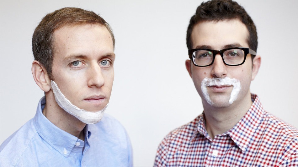
Before Jeffrey Raider and Andy Katz-Mayfield even launched Harry’s, an online service for men’s grooming products, they had their eyes set on a first acquisition. The pair wanted to buy an old German razor factory for $100 million.

That isn’t how most new startups operate, but then again this wasn’t Raider’s first time around. Raider was one of the cofounders behind Warby Parker, the popular e-commerce service for eyeglasses founded in 2010 and currently said to be valued at around $500 million.

In 2011, Raider received a call from Katz-Mayfield, a friend, who complained about his experience buying razors and shaving cream at a store. “Could you do it better?” Katz-Mayfield asked. That conversation sparked the idea for a company that would sell high-quality shaving products for a reasonable price to compete with more established businesses like Gillette and The Art of Shaving and upstarts like Dollar Shave Club. But it turned out to be harder than they thought to find high-quality razors.

Read full story on Mashable

harry's

I don’t smoke and I never did in my whole life. And I hate when people smoke in private or in public (something very common in Lebanon, especially the moment they enter Beirut Airport building after landing).

During a passage at Prague airport, I saw the below billboard for Marlboro, which on top had a new logo, so I was wondering if Philip Morris is changing its famous brand name with a more modern font.

While digging into this, I have found another amazing thing about the Marlboro logo, the graphics on the below Formula 1 car are either deceptively genius or quite a coincidence. Apparently when the car is racing around the track at 200 mph the barcode creates a blur which suggests the Marlboro logo, even though advertising tobacco is banned in the sport.

Petco Animal Supplies Inc. unveiled a new logo and tagline that stresses pet health.

The new tagline, “Where the healthy pets go,” updates the old tagline by adding the word “healthy.” The new logo also incorporates the new tagline.

Today, Pecto has more than 22,000 employees at 1,000 stores across the U.S. carrying up to 10,000 “different pet-related items for dogs, cats, fish, reptiles and amphibians, birds and small animals.”

Summer is here and it is hot. All supermarkets are shrinking their frozen category shelves and groceries are putting their small freezers in front of everything else to welcome the ice cream season where sales will pick up because of the hot summers we have in Lebanon.

Lebanese consumers are very familiar with ice cream brands, for me and since i was a kid, still remember mainly Gelati Cortina and Bonjus, then many local brands came along like Gelati Dolsi and last year we had a new player Cornelli. This post is not about international ice cream brands, but most of them are also on the Lebanese market.

Bonjus ice cream is a brand extension to the original juice product that is 46 years old and to a certain extend it fits and serves the global brand positioning among other players. Well managed brand extensions not only provide new sources of revenue, they can also reinforce brand meaning and help to build brand equity.

But sometimes the brand extension and stretching can hurt and damage the parent brand.

Taanayel Les Fermes ice cream is not the right brand extension for a typical dairy products brand.
No matter how juicy and succulent the advertising campaign is and will be, my first thought will always be the dairy products because of the brand name in first place.

Surely milk is used in both lines (dairy and ice cream) but for me, the brand does not fit the product.

After Karl Lagerfeld for Coca-Cola, Paul Smith for Evian and Missoni for San Pellegrino, it is Christian Lacroix who will revamp beer 1664. Christian Lacroix, a symbol of elegance and refinement to the French, is known for its bright colors and unique style.

Therefore, Brasseries Kronenbourg, who wish to reposition the iconic 1664 beer by playing the card of the “French taste” asked him to imagine the packaging of its next limited edition. Thus, the friendly and authentic 1664 beer will be all dressed by Christian Lacroix, from the month of June 2011.

“Our new name PostNL symbolizes the reliability and down to earth approach of our company. This name does justice to our past, something we are very proud of. By the same token we emphasize that we are a true Dutch company, with ambitions that go beyond mail and operations that reach beyond our borders. Our three-sided logo symbolizes the heart of our company, with mail, parcels and e-commerce at the core.”

Full Press Release