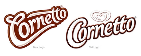
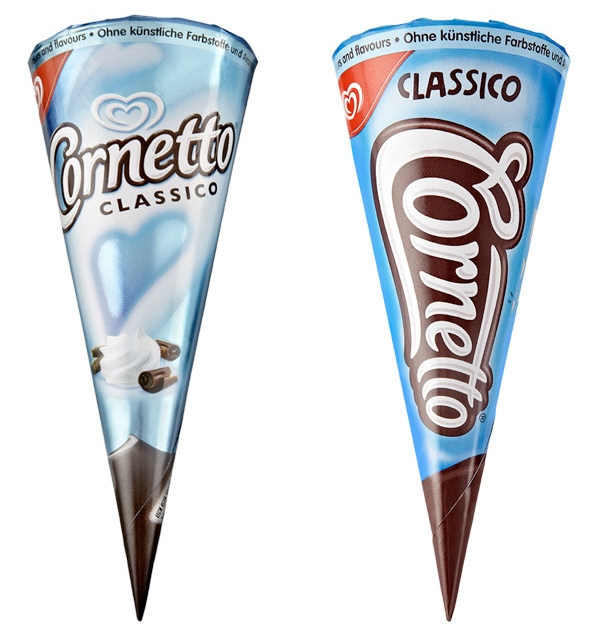
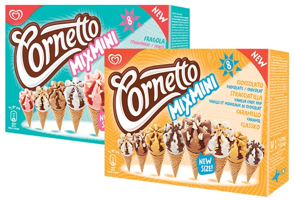
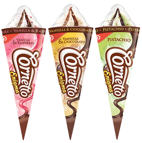
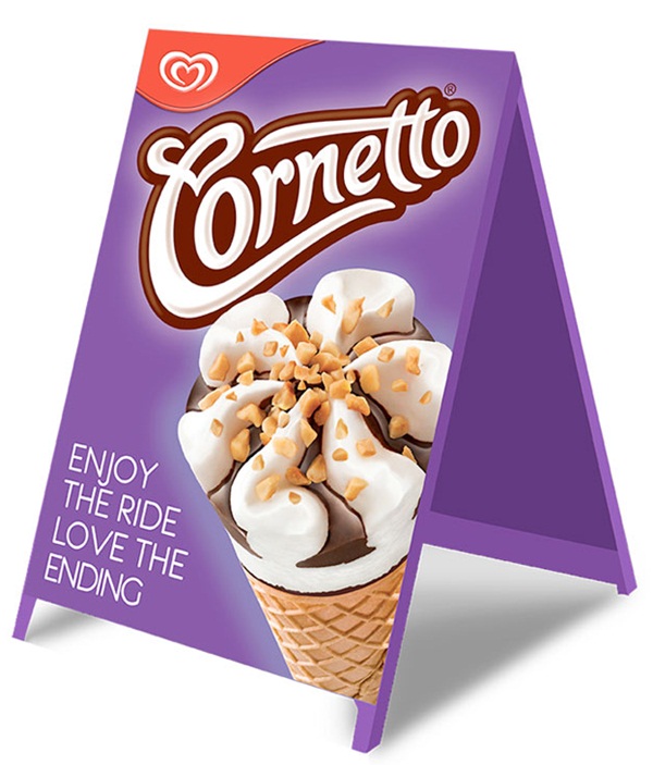
Cornetto New Look
Tatra, one of the most known powder milk brands in Lebanon long time ago is having a new look.

EBay Inc executive Devin Wenig unveiled a new logo on Thursday. The new logo keeps eBay’s famous colors, red, blue, yellow and green, but the letters are thinner and arranged inline, rather than the previous, slightly jumbled approach.
A lot like the old logo, but with a cleaner font.

This fall, Diet Coke is re-introducing its stylish cropped logo design for its aluminum can. The refreshed packaging design was created by San Francisco-based design agency Turner Duckworth, and features a section of the Diet Coke logo, cropped to feature the “D” and the “k,” set against the brand’s signature silver backdrop.


Fresh Market is a Polish chain of convenience-type stores with 100 POS today and a foreseen potential of 500 stores in the future, part of Zabka Polska.
Diavlo is one of my favorite fonts, it is a free font that contains 5 weights: Light, Book, Medium, Bold and Black.
Fresh Market used Diavlo in a very creative way in their logo and brand identity with a small change in the initial F and adding a flower that is a freshness symbol.


The Posters

The Real Car